British National Formulary
Branding and design for the pharmaceutical body to create a cohesive identity across its products
Getting critical information quickly
The British National Formulary (BNF) is Britain's foremost pharmaceutical reference book. It contains the dosages and interactions of drugs available under the NHS, and provides pharmacists, doctors, nurses and healthcare professionals with prescription advice.
The BNF is published by Pharmaceutical Press (of the Royal Pharmaceutical Society). I worked alongside Modern Human, a consultancy, to deliver new, digital products and create cohesion between the organization’s brand and printed products.
Modern Human began by researching how medical professionals use the BNF. They observed doctors, nurses, pharmacists and GPs in their work environment in order to understand their goals and needs. With their findings, Modern Human created a concept for a digital product providing quick access to critical drug information.
Evaluating a brand
Before creating new digital products, we needed to evaluate the existing brand to understand how different products related. The evaluation was clear: the BNF and its sibling publications (BNF for Children, NPF) each had identifiable traits but no shared identity. There was little consistency in the use of publication logos or design of marketing collateral. It was our chance to unify everything with a new, overarching identity.
We asked stakeholders to describe attributes of the BNF publications, and used the words to develop a tone of voice. I chose a typeface (FF Dagny) that embodied these traits: authoritative, trusted and approachable. I created new wordmarks for the BNF, BNF for Children, NPF and the publisher, BNF Publications.
Next: Defining an identity


Defining an identity
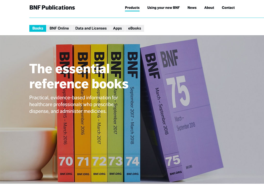
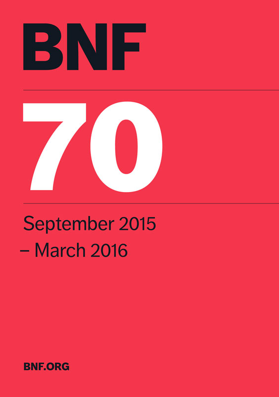
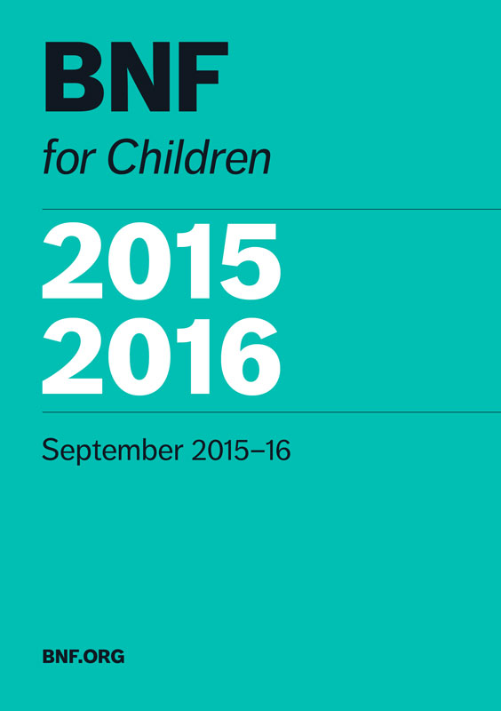
Perhaps the most striking aspect of the BNF is the color of its cover. Every edition, since 1981, has been different to the previous. One reason for this was to avoid outdated editions, for which the consequences could be serious. The colors have occasionally followed a repeating pattern, but often deviated with cover changes.
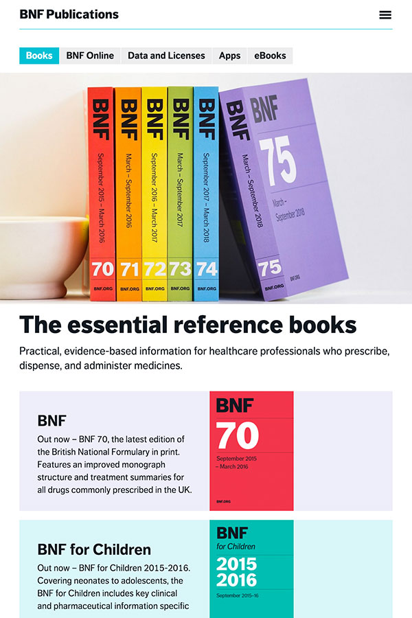
I recognized that a carefully selected set of colors could be used in longevity to unify the three publications, and to drive the BNF Publications brand. I created a flexible color system and eleven book covers to establish its usage.

To explain the broader design strategy, I wrote brand guidelines which outlined typography and color usage, and demonstrated the brand’s application in digital and print. I provided examples by designing a letterhead, business cards, name tags and social media avatars.
Designing a mobile app
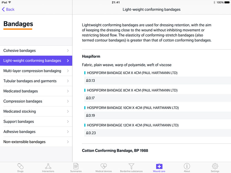
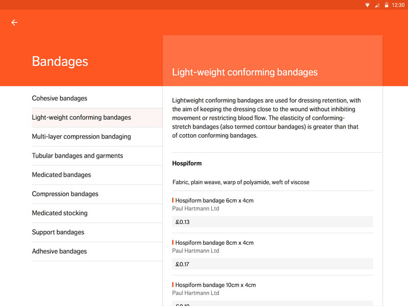
With a brand identity in place, we started on a mobile app for iOS and Android. The product architect defined the information architecture and features, following the earlier concept. We decided early on that functionality and content should be the same on both platforms, and the interface familiar and intuitive.
In designing the interface and interactions, I applied elements of the brand such as color, fonts and visual cues but kept closely to the platform’s visual language. For iOS, I followed Apple’s Human Interface Guidelines and for Android, Material Design. The result was an app that provided users with instinctive, intuitive ways of accessing important data.
Next: Building a website






Building a website
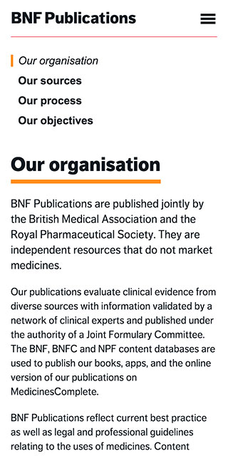
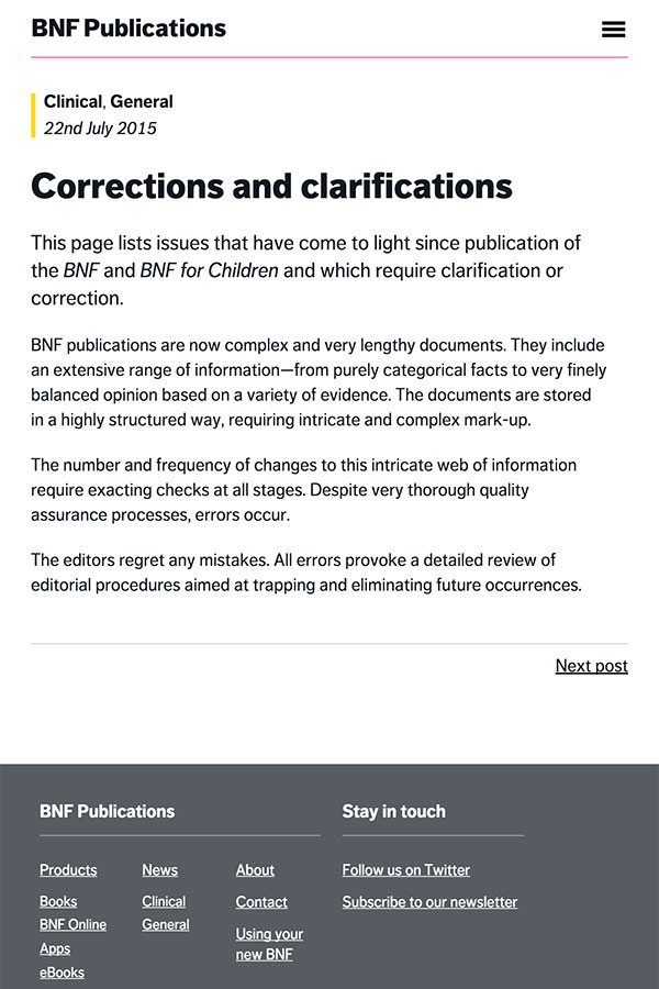
The goal of the BNF Publications website redesign was to bring it in line with the new brand and promote the organization's books and digital offering (namely the mobile app and data API). I designed the website, and built it in WordPress, coding both the front- and back-end. The CMS provided the editorial team with reliable means of publishing corrections and soliciting consultations.
